Company:
Turum-burum
Role:
UX Designer
Timeline:
2018 — 2019
Results and metrics
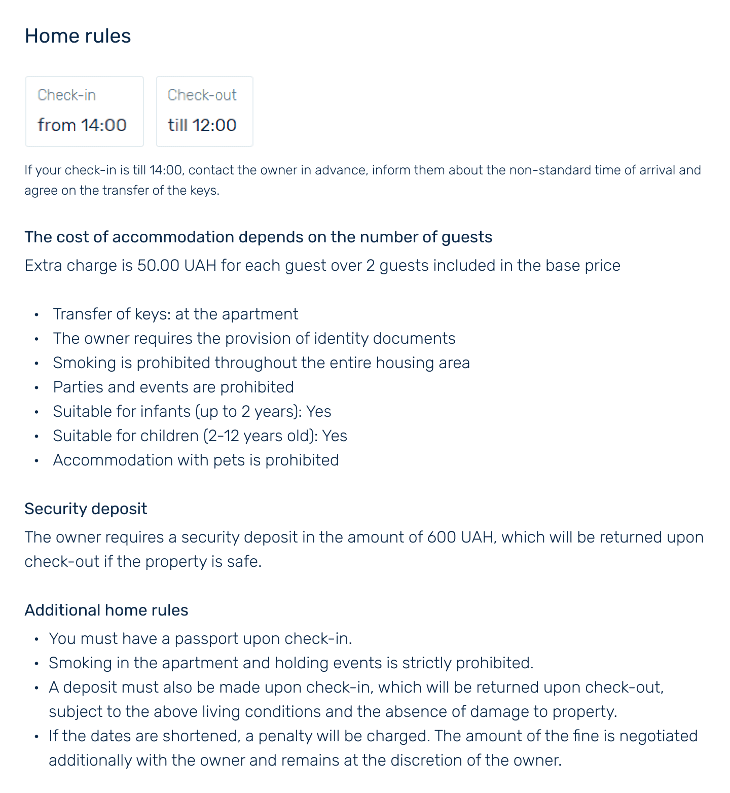
Problems
The website wasn't responsive and had a separate mobile version, which lacked many important features available in the full version. For instance, the mobile version didn’t have a user profile page at all.
The use of filters when searching for apartments was inconvenient—information was poorly organized, and some important filters were missing, although they were present on competitor sites.
Users didn’t stay long on apartment pages—they often left without starting the booking process.
Quite frequently, users didn’t complete the booking process.
The unique apartment comparison feature, which competitors lacked, was used by a very small number of people.
Overall, the UI was outdated (high information density, lack of consistency, mismatched colors, etc.).
Solution
A complete redesign of the site was carried out based on the Mobile First concept, drawing from research data and insights provided by the product owner.
Why a full redesign and not a targeted update?
The website had two versions — desktop and mobile — which was technically inefficient for this type of product and complicated for the team’s resources. All functionality could be implemented in a single, adaptive version of the site. It was clear that a complete redesign was necessary to achieve this, so we took on the task of overhauling the design.
Why Mobile First?
By the time we started working on the product, the majority of site visitors were already using mobile devices, and their number was growing. With this trend, it made sense to prioritize mobile device design as the primary focus.
What I've done
Participated in both online and offline meetings with stakeholders to gather requirements.
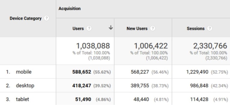
Studied Google Analytics data and applied it in my work.
Analyzed competitors.
Created prototypes of key site pages.
Reorganized the filters in the search results (the list of apartments in a city), making them significantly easier to use—this was evident from the metrics (the time from visiting the site to starting a booking was significantly reduced) and the decrease in support inquiries.
Simplified the apartment comparison feature, a unique functionality of Dobovo that competitors, including Airbnb, still lack. Comparing apartments became easier, allowing users to make quicker decisions from the vast selection.
Approach
Together with the Dobovo team, we decided to adhere to the following approach:
1. Initial Assessment
We review Google Analytics data, analyze the current site and competitor sites, and prepare a long list of questions as a result.
We iteratively design the mobile-first prototype and present it to the owner.
Once the prototypes are approved, we begin designing the interface for tablets and desktops while simultaneously working on the UI.
The product team consists of experienced professionals with comprehensive knowledge about the product and its users. Communication with the Dobovo team became the primary source of insights for the successful execution of the project.
We, along with the product owner, conducted dozens of group calls and several offline meetings, during which a large number of questions were asked and answered. All the information gathered was documented, and we continuously referred to it throughout the project.
Competition
I analyzed Ukrainian competitors and similar products on the global market, highlighting interesting solutions on their websites.
Afterward, together with the product owner, we decided which of these solutions would be incorporated into the new design.
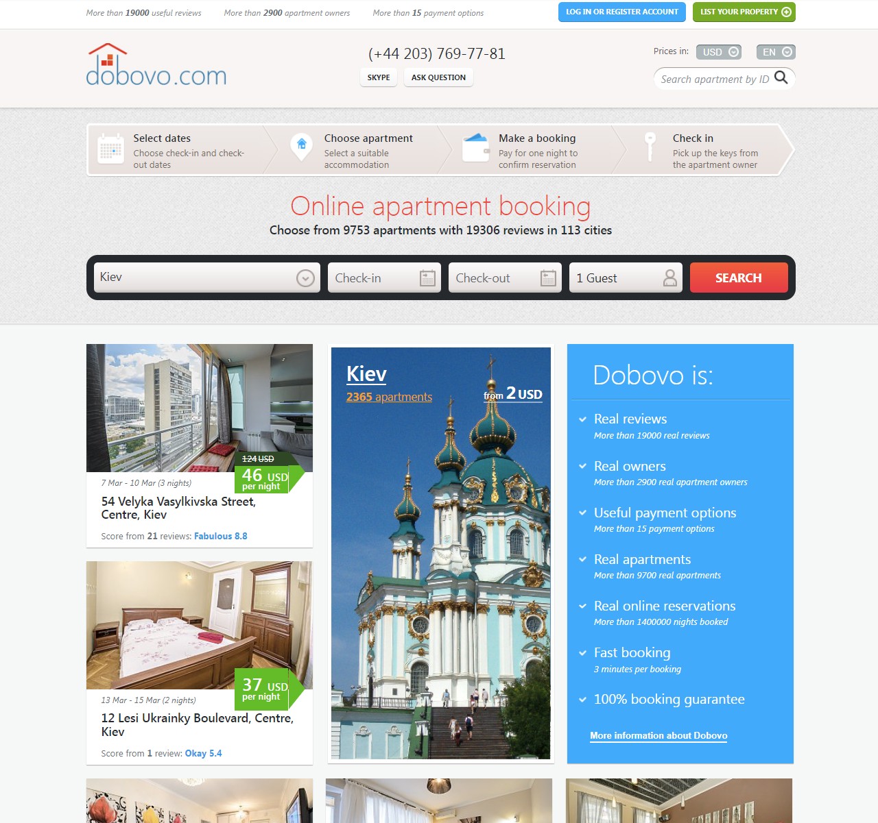
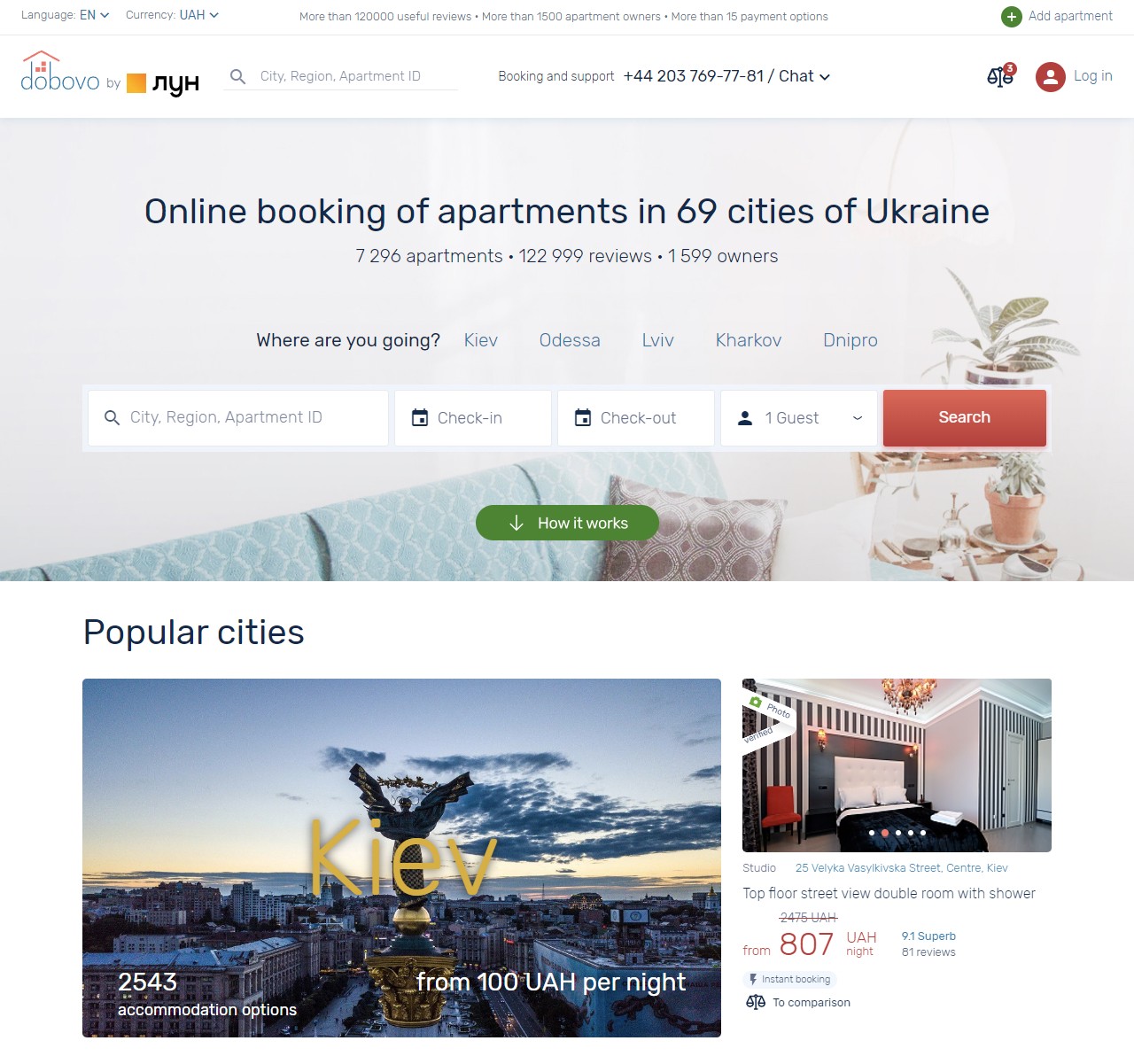
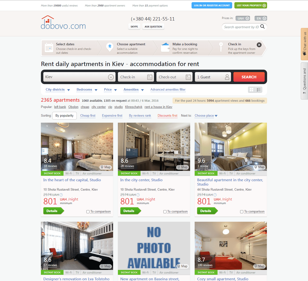
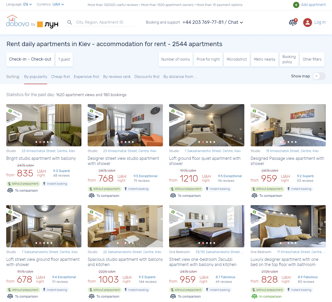
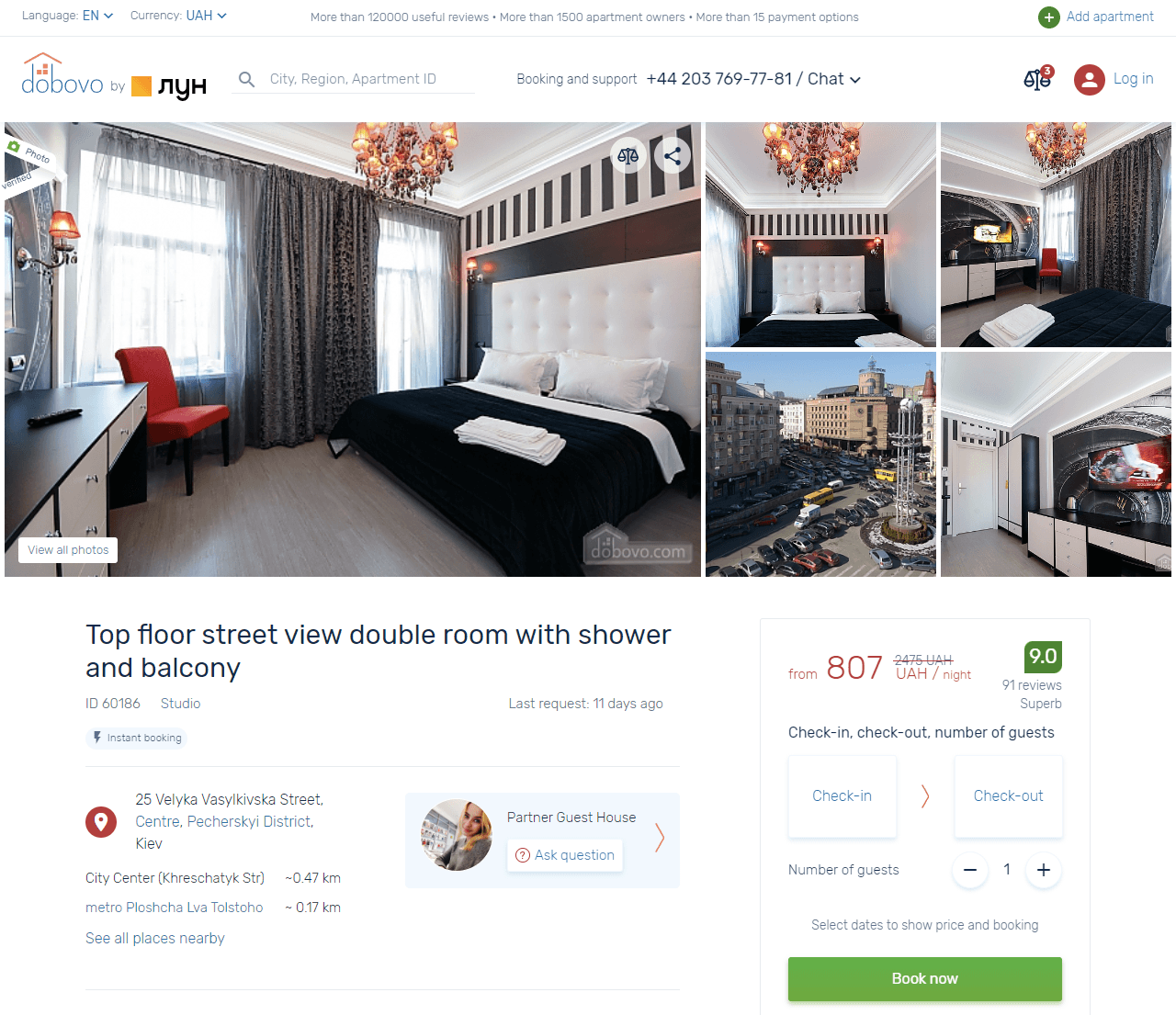
Search results (list of apartments in the city)
The search results page is one of the key pages on the website — it's where the majority of apartment selections are made.
Changes to the current filters
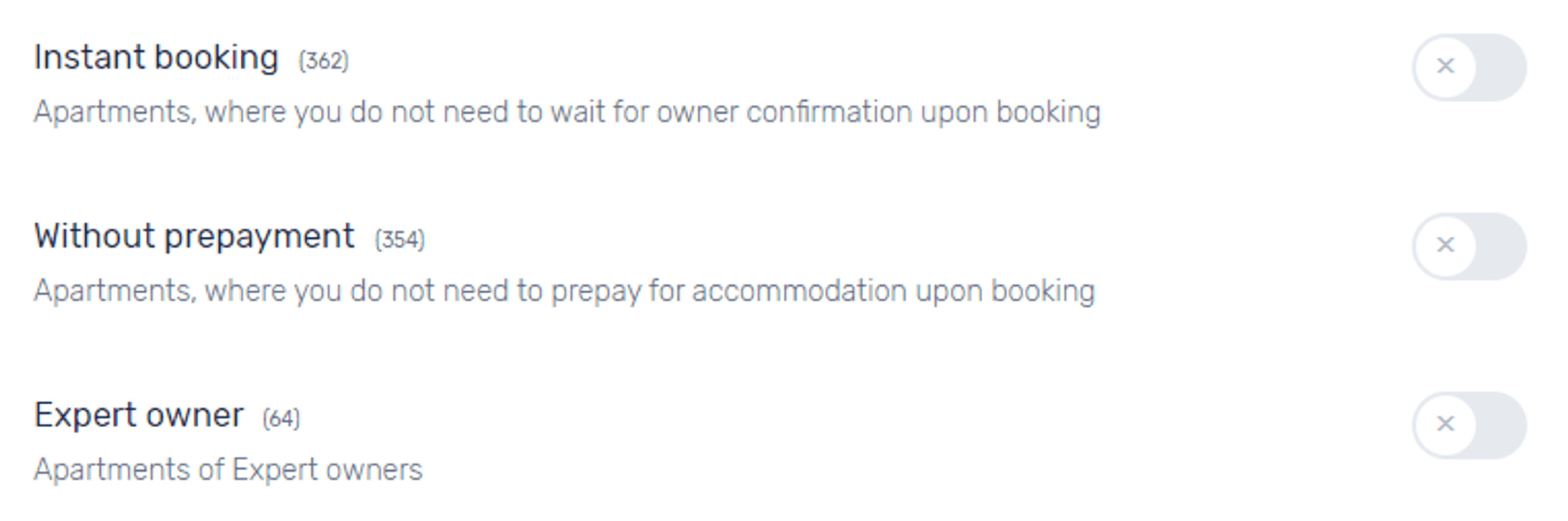
The filters for "type of accommodation" (entire place, private room, shared room) and "property type" (apartment, house, hostel, hotel) were separated from the "number of rooms" filter (it wasn't clear why they were grouped there), creating two distinct filters.
The "additional filters" mainly contained amenities. I moved them into the "features" filter, where some amenities were already located.
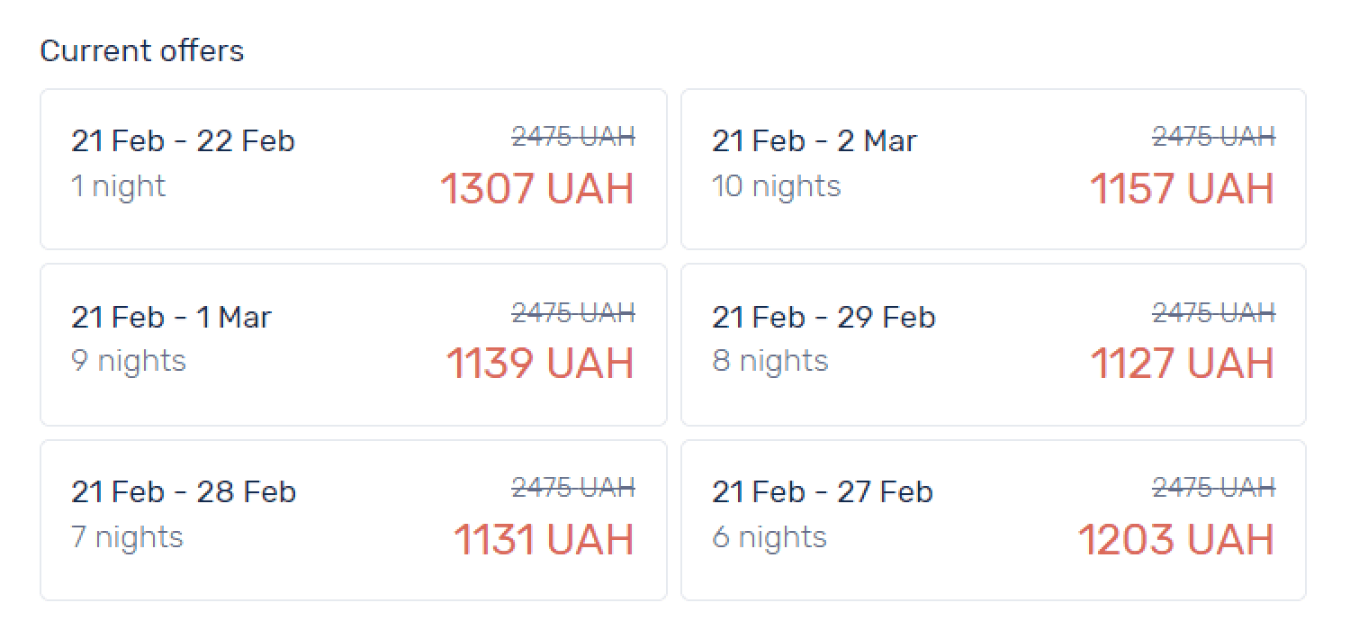
Simplified the price per night selection by adding a slider to choose the price range, making it easier than manually entering the values.
Next to each filter, I displayed the number of apartments available for booking that match the filter criteria.
Newly added filters
Nearest metro station (if available in the selected city)
Streets
District (previously only neighborhoods were available)
Landmarks
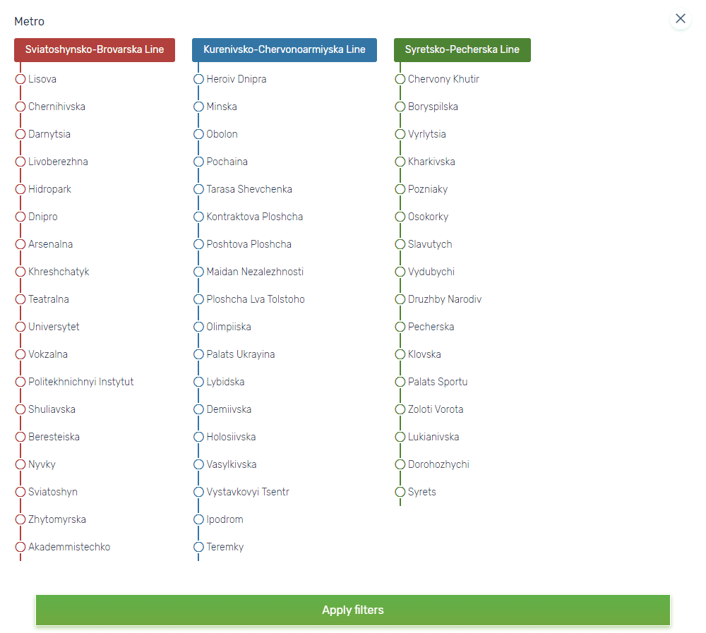
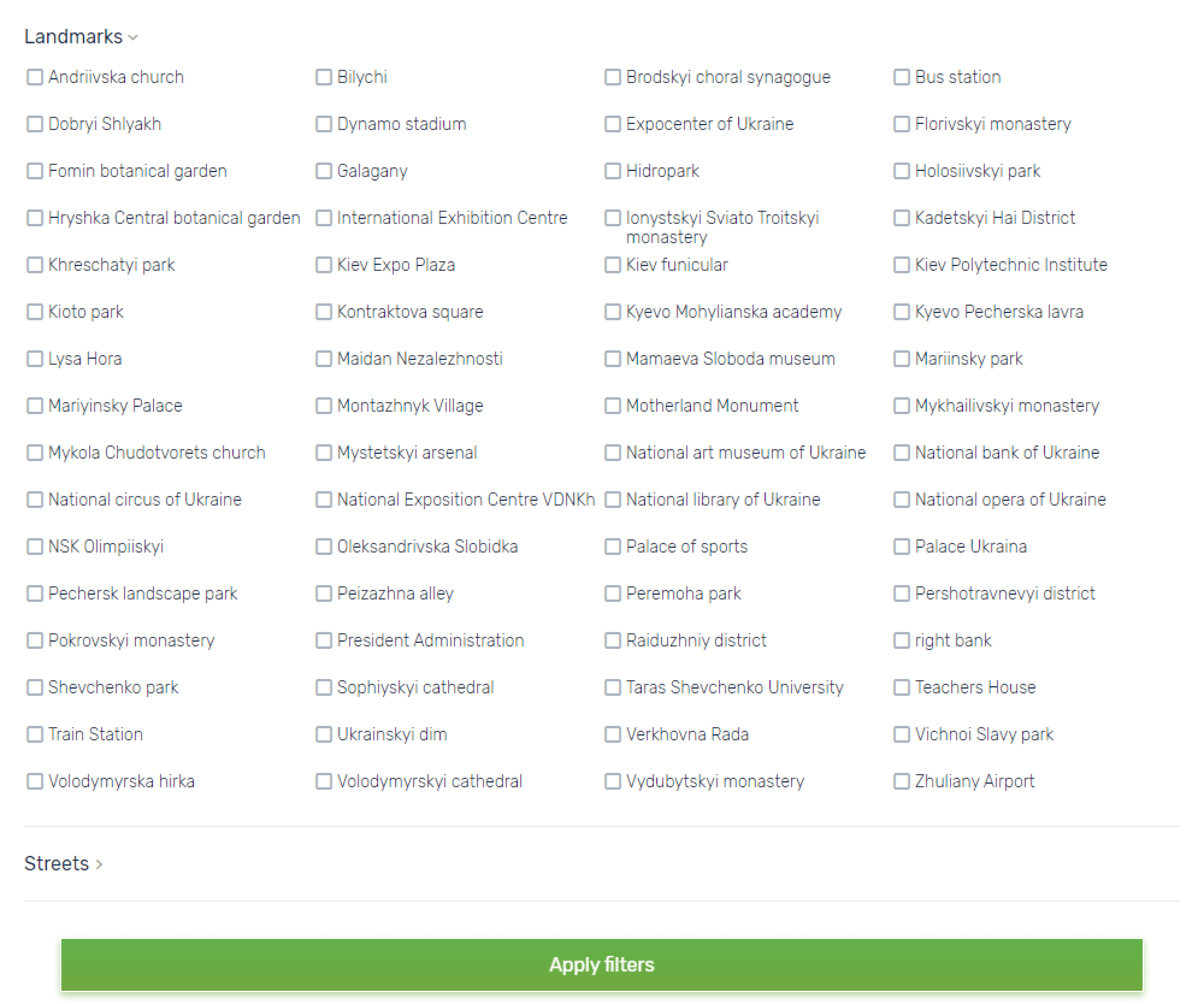
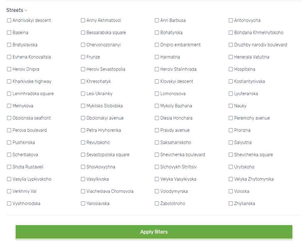
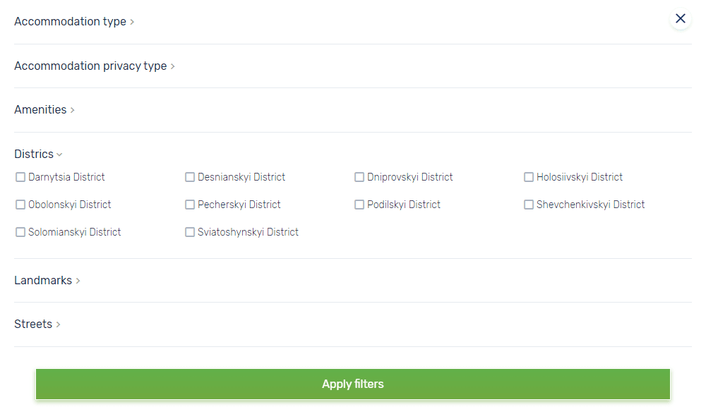
According to support team feedback, users have repeatedly requested the addition of these filters to the website.
Filtering by apartment attributes
Displaying all found apartments on a map
Previously, it was only possible to view the location of a specific apartment on the map. I proposed adding the ability to display all apartments from the search results on the map—this makes it easier to choose if location is a key factor.
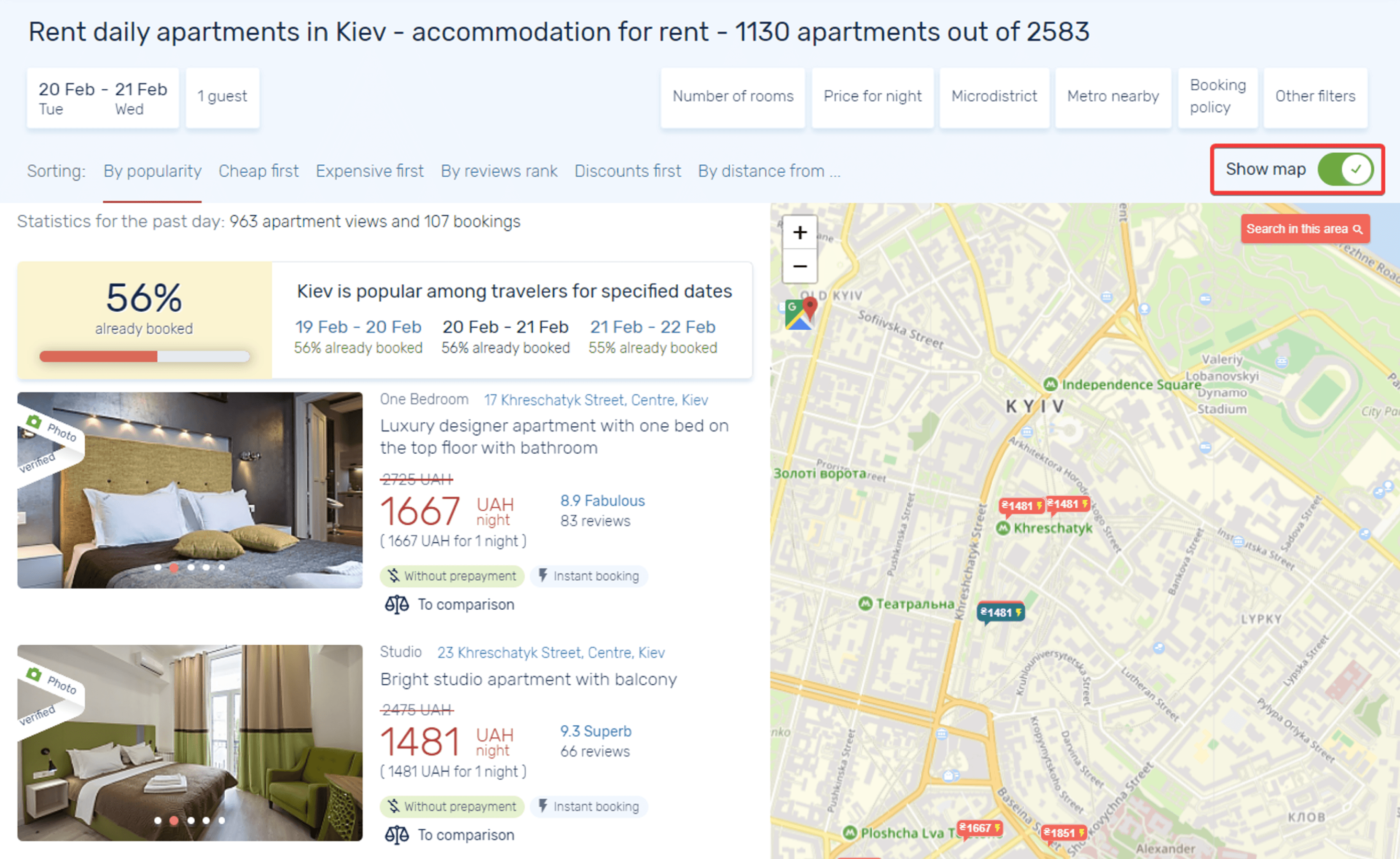
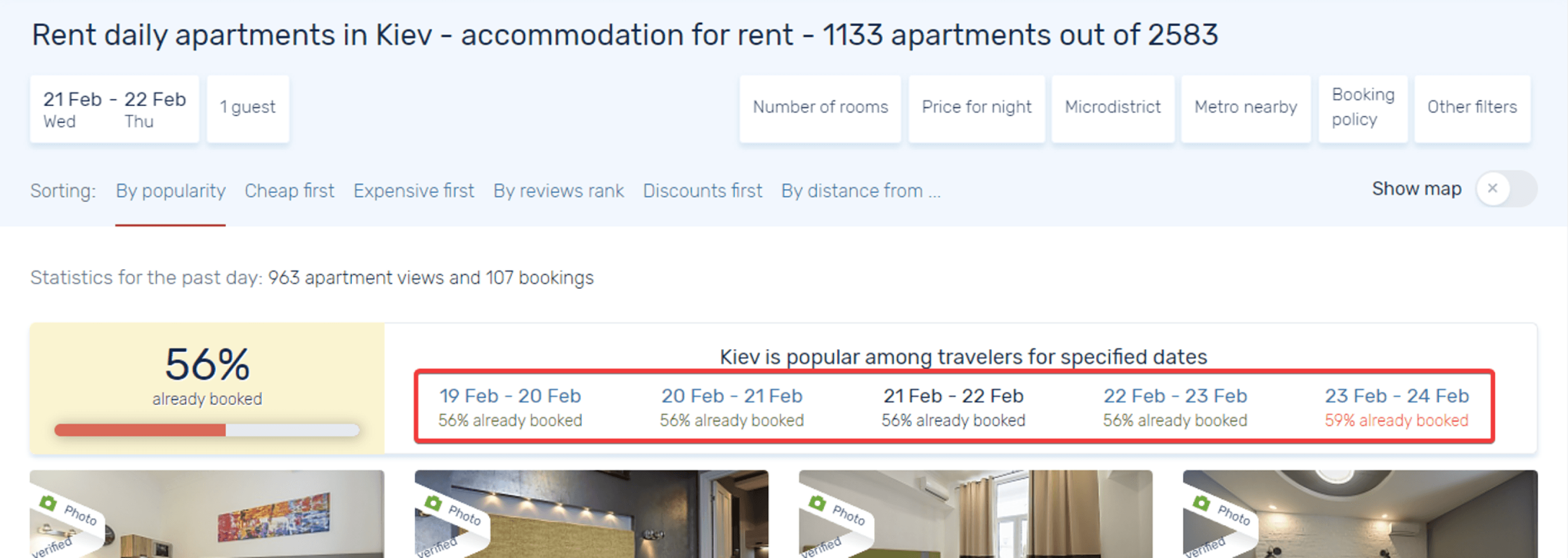
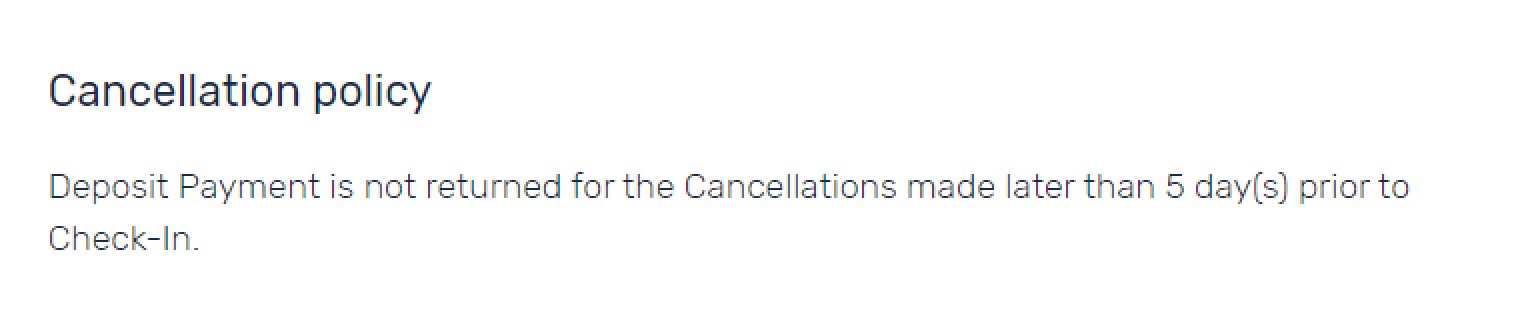
Booking statistics for selected dates
I added information showing the percentage of apartments already booked for the selected dates. If the percentage is high, this can encourage users to hurry and complete their booking.
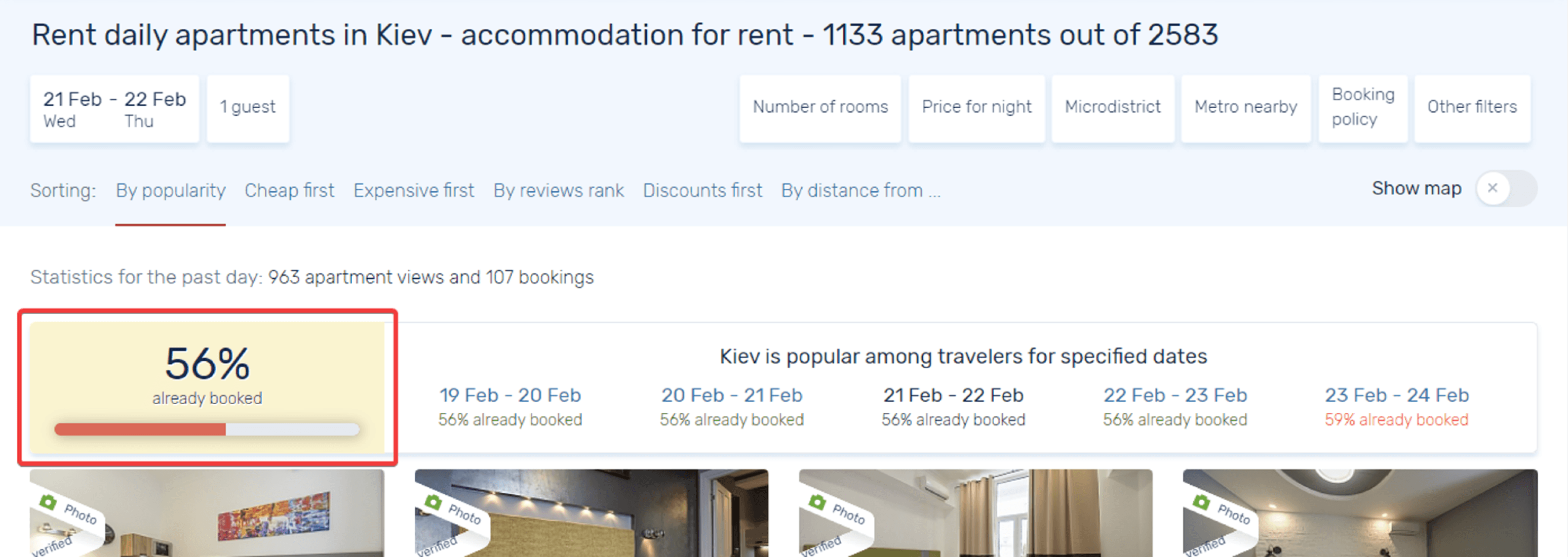
Neighboring dates and their booking statistics
I also displayed the booking percentage for neighboring dates, allowing users to easily select nearby days if they are unable to find suitable accommodation for their originally selected dates.
Apartment Comparison
Comparison problems
Despite the usefulness of the feature, only a small portion of users were utilizing it. I hypothesized the following reasons:
The absence of check-in and check-out date selection, which meant it was impossible to compare apartments based on the price per night—a key factor for a large number of users.
Poorly structured information about the compared apartments, without clear separation into blocks, making it visually difficult to digest.
Solution
I added the option to select stay dates, making it possible to display prices per night.
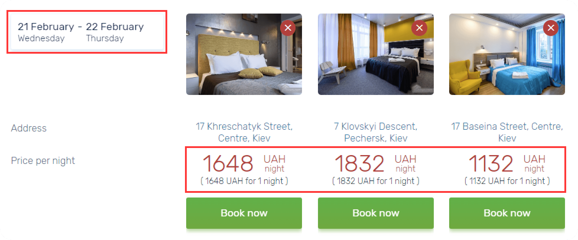
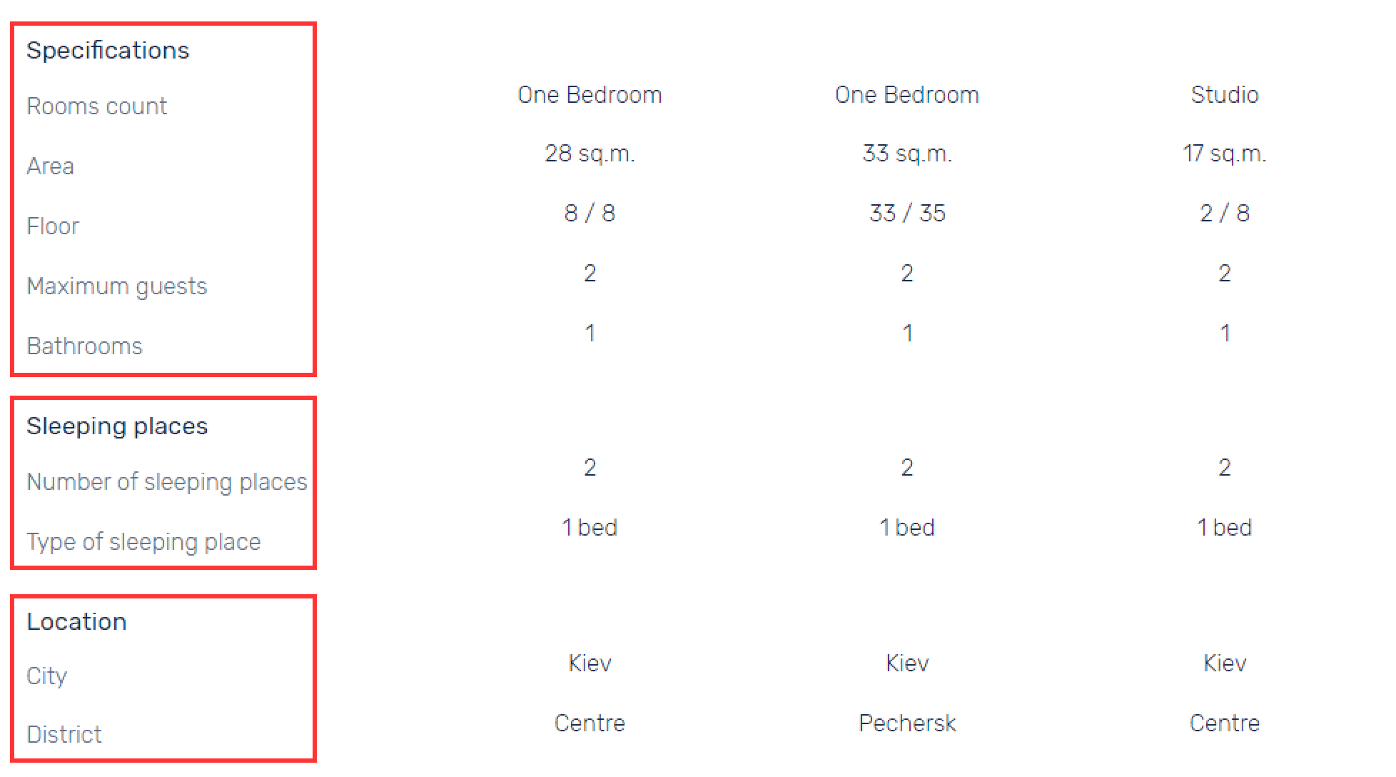
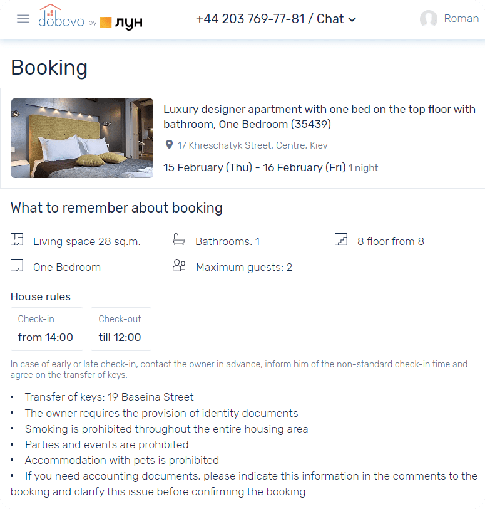
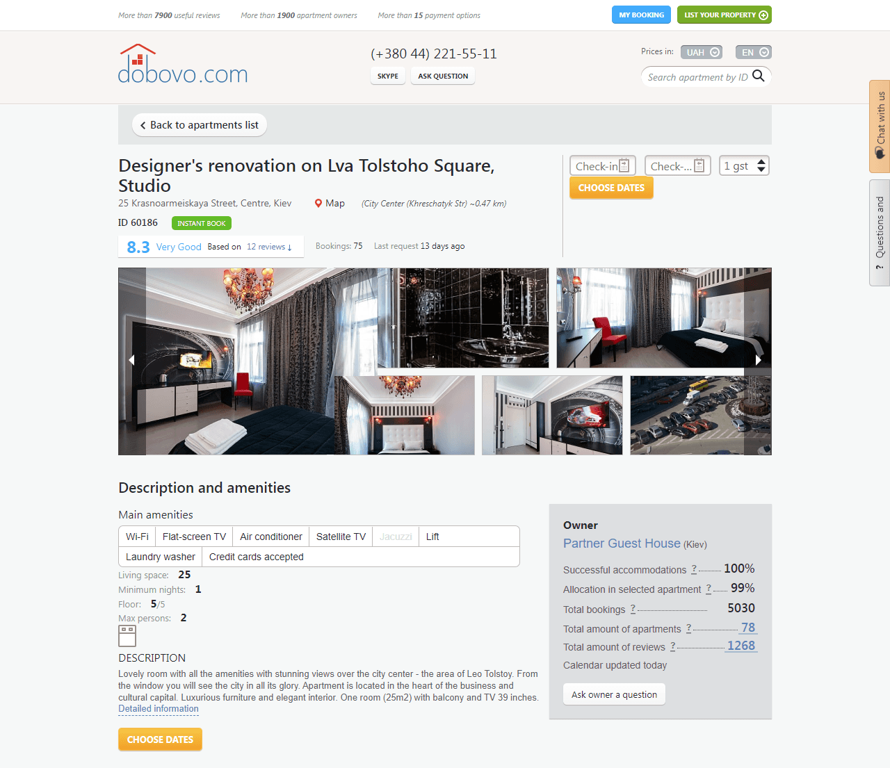
Apartment page
During the analysis of the current site and competitor products, it was noticed that the information on the apartment page was not well-structured and was, hypothetically, insufficient for making a decision—whether to book or not. I decided to slightly adjust the order of the blocks on the page and add information that was missing but available on competitor sites.
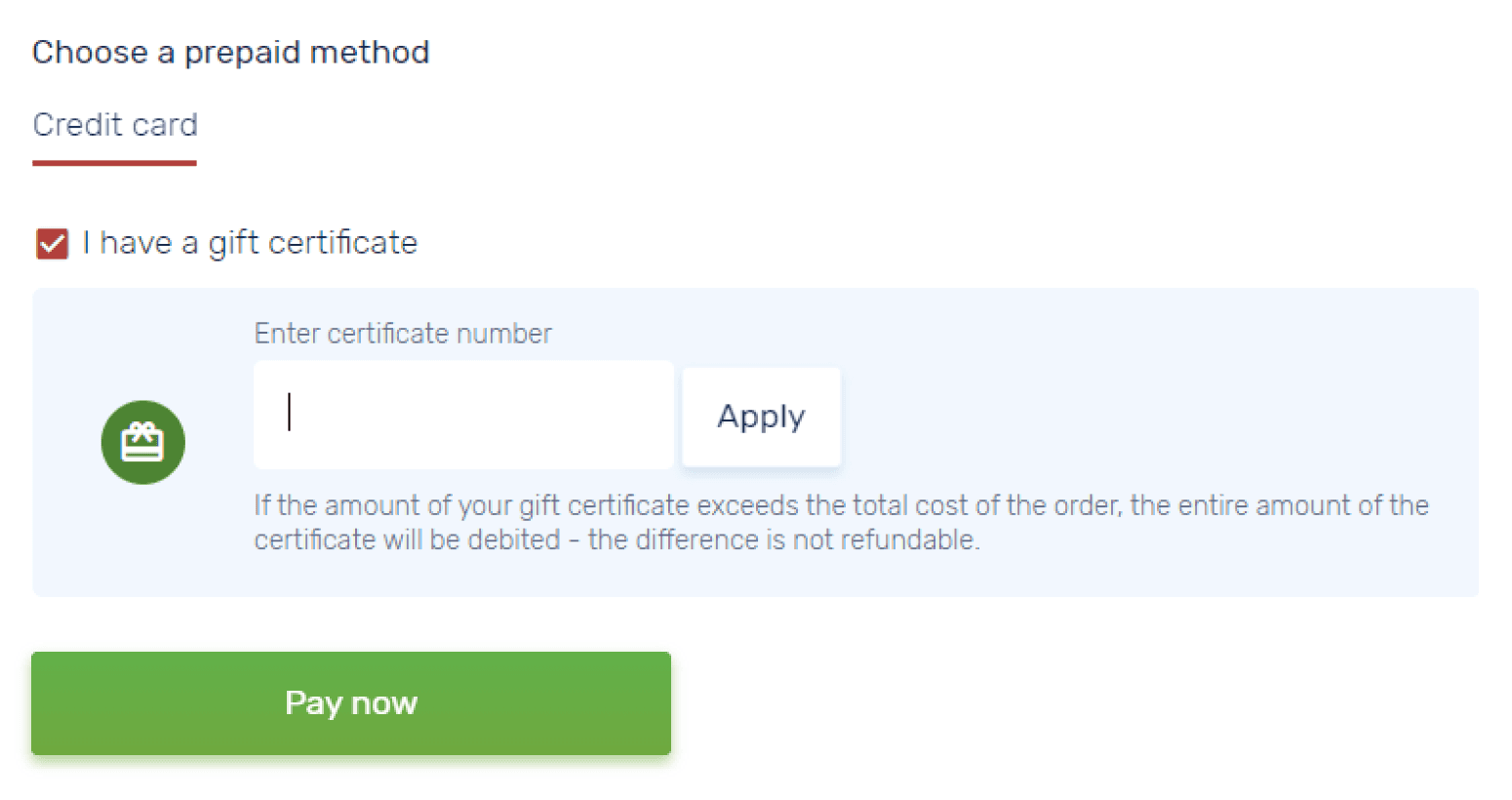
Booking
Although the booking process was already well-established, users often didn't complete it and left the site. I didn’t have exact information on the reasons for this, so I could only speculate.
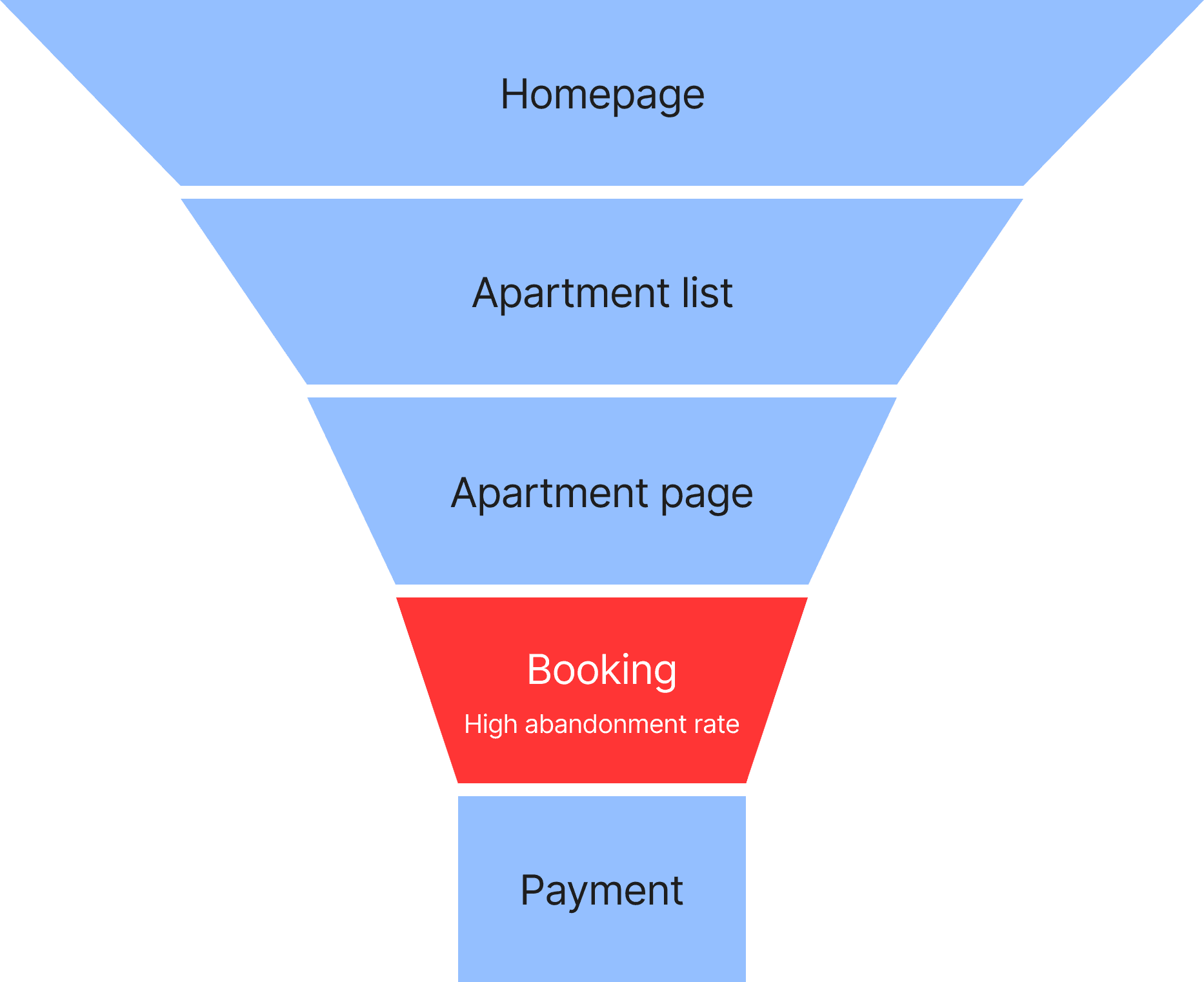
The product team was hesitant to completely overhaul the booking process, so it was decided to make only a few changes, relying on common sense and best practices.
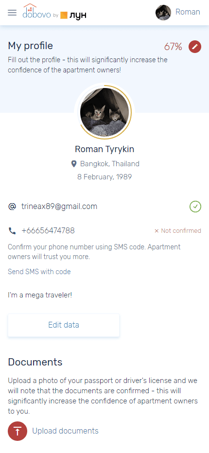
User Account
This part of the product was completely absent in the mobile version of the website. I reviewed the existing user account, created prototypes for all states, and handed them over to the designer to work on the UI.
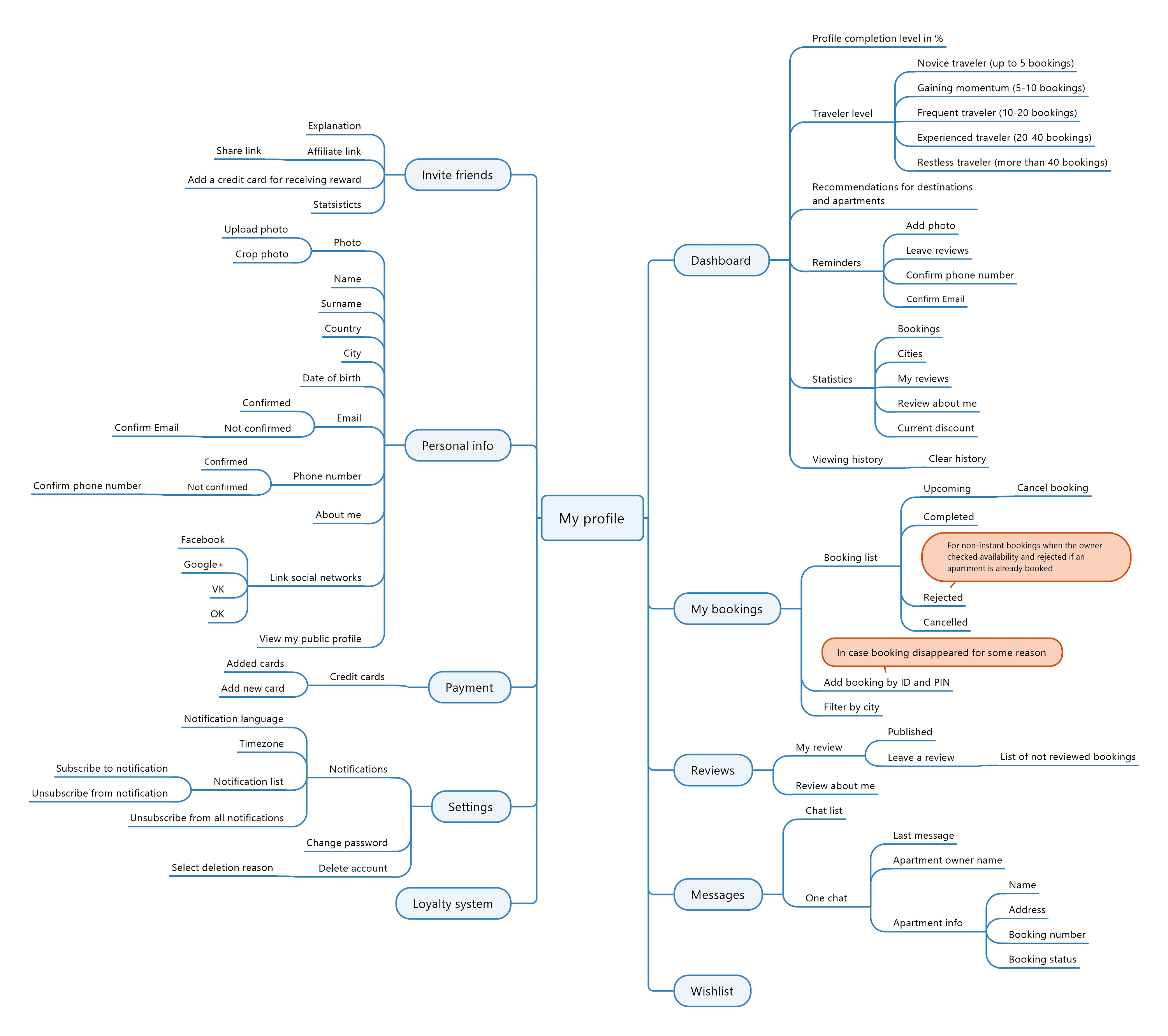
Now the profile and all its features are accessible on any device.
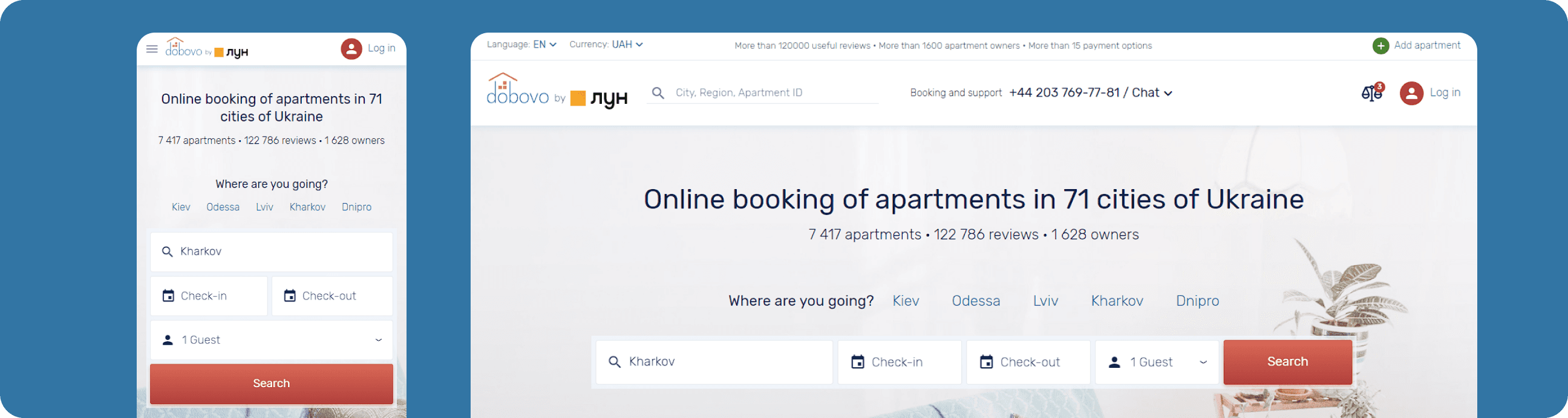
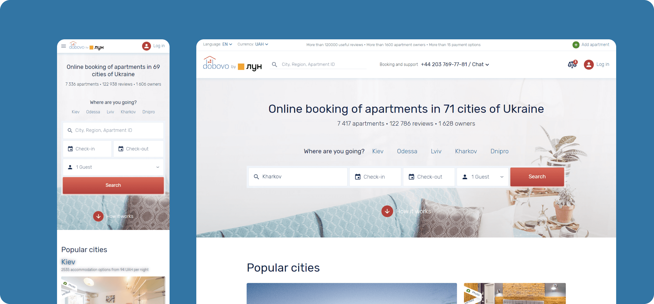
Before and After
Evaluate the transformation. It is recommended to view it on a desktop.
Current status
The product is successfully operating and evolving. At the end of 2019, Dobovo announced a partnership with LUN, the largest player in the apartment search market. This partnership has elevated the short-term rental market to a new level, helping both Ukrainians and foreign guests travel more frequently and comfortably within the country.