About this case study
Drawbacks of the current design
I reviewed the current design of the Bitazza app and identified the following design drawbacks:
Small size of both static and interactive elements.
Low color contrast in some parts of the app.
Complex flows: too many taps and screens.
Lack of personalization.
Insufficient use of standard UX patterns.
Redesigned flows
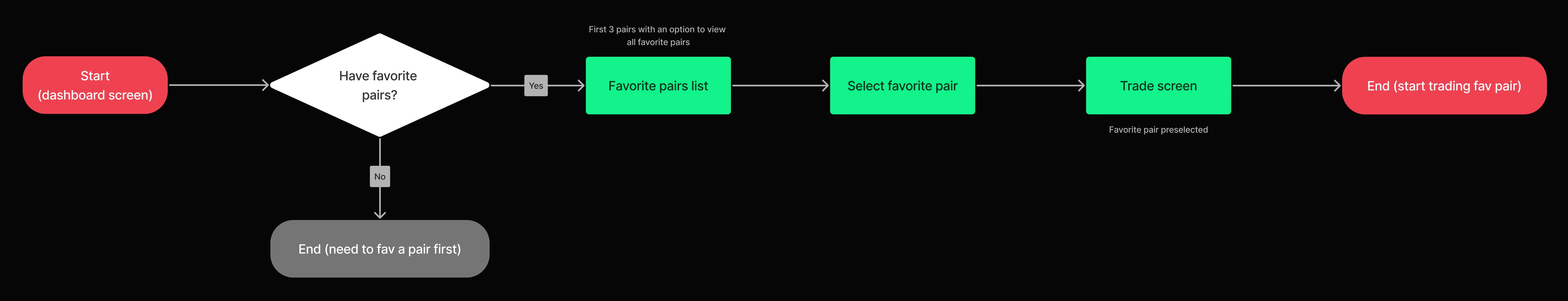
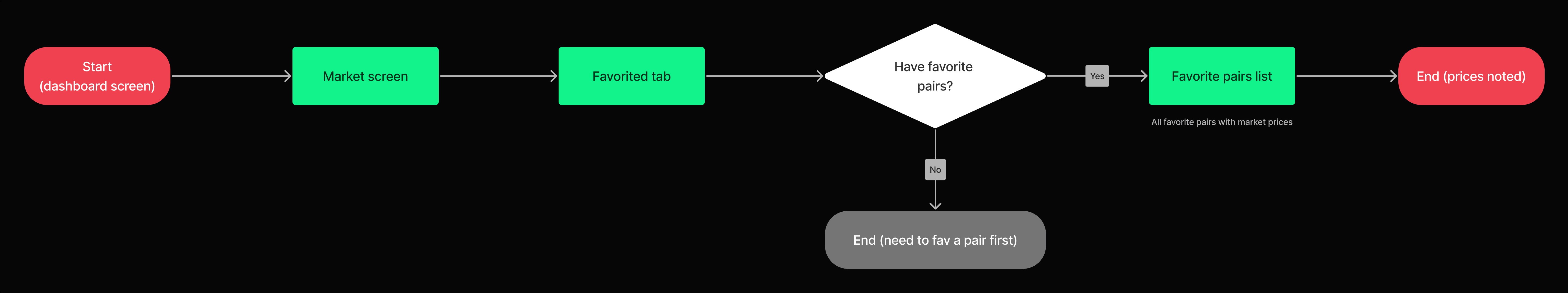
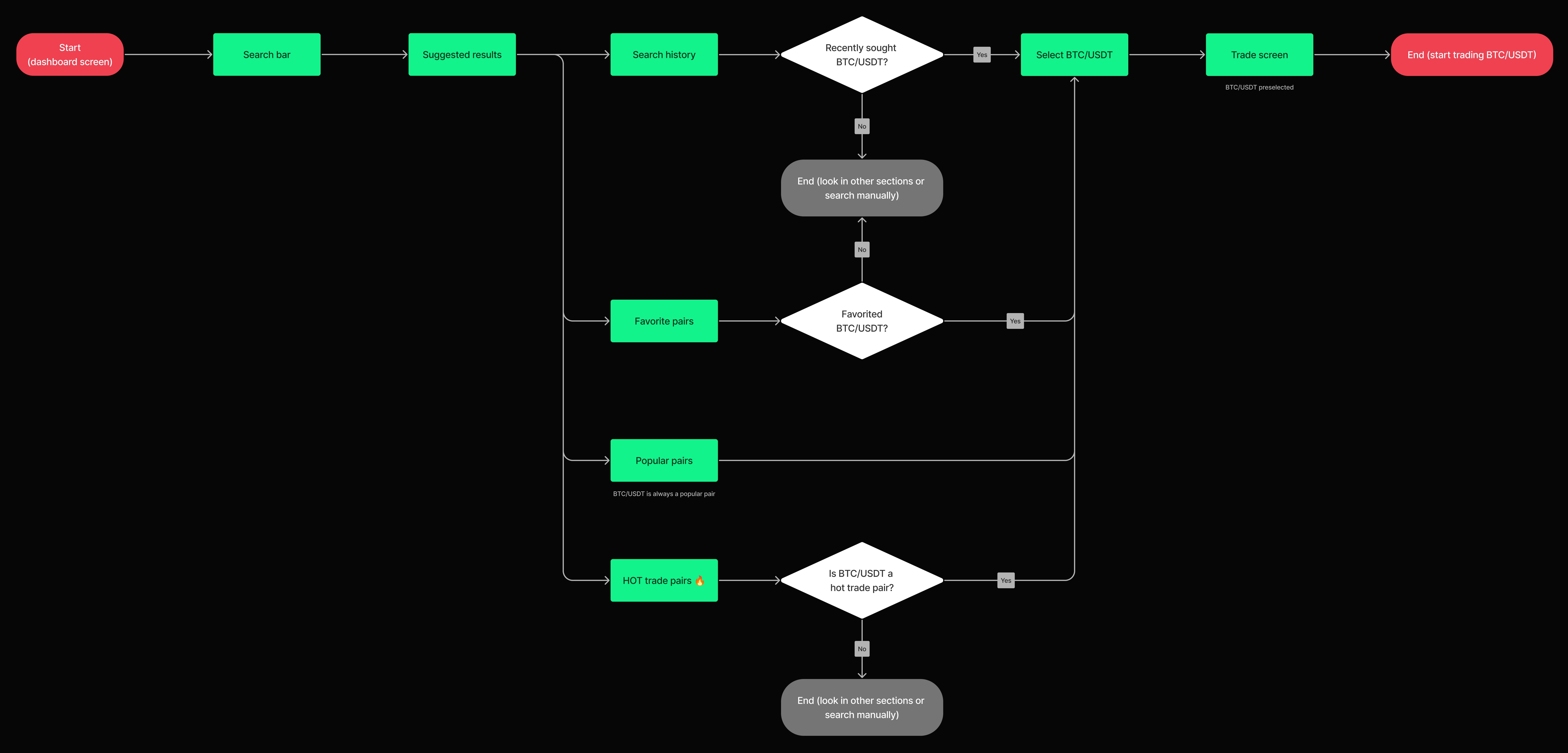
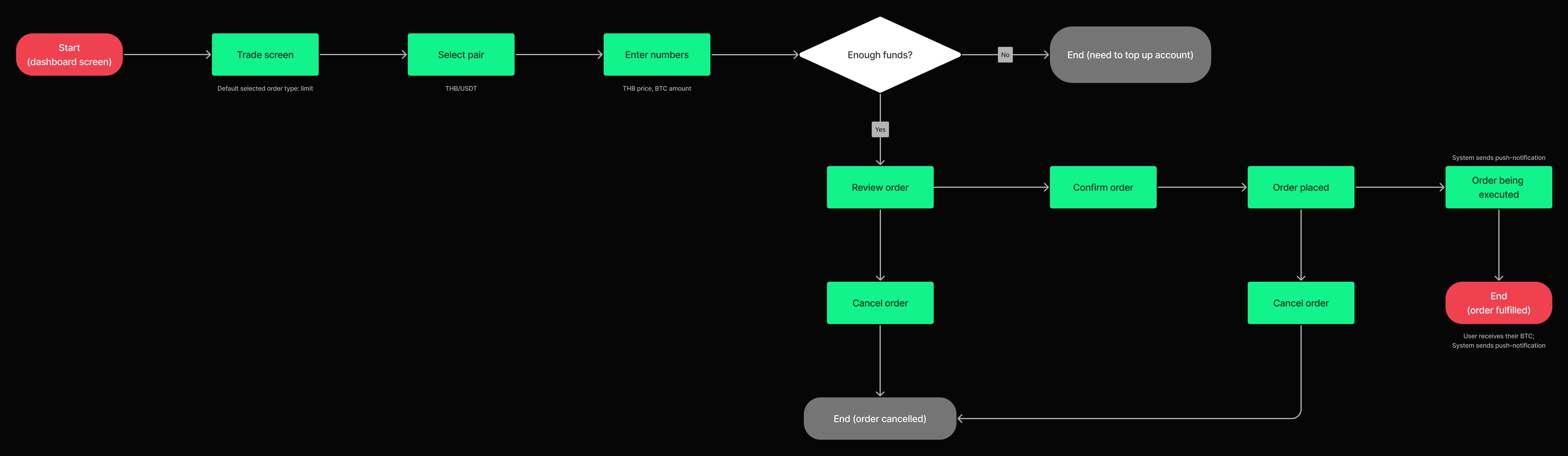
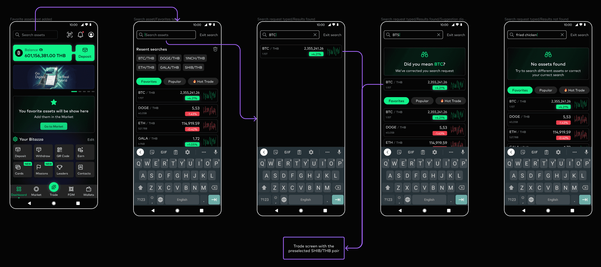
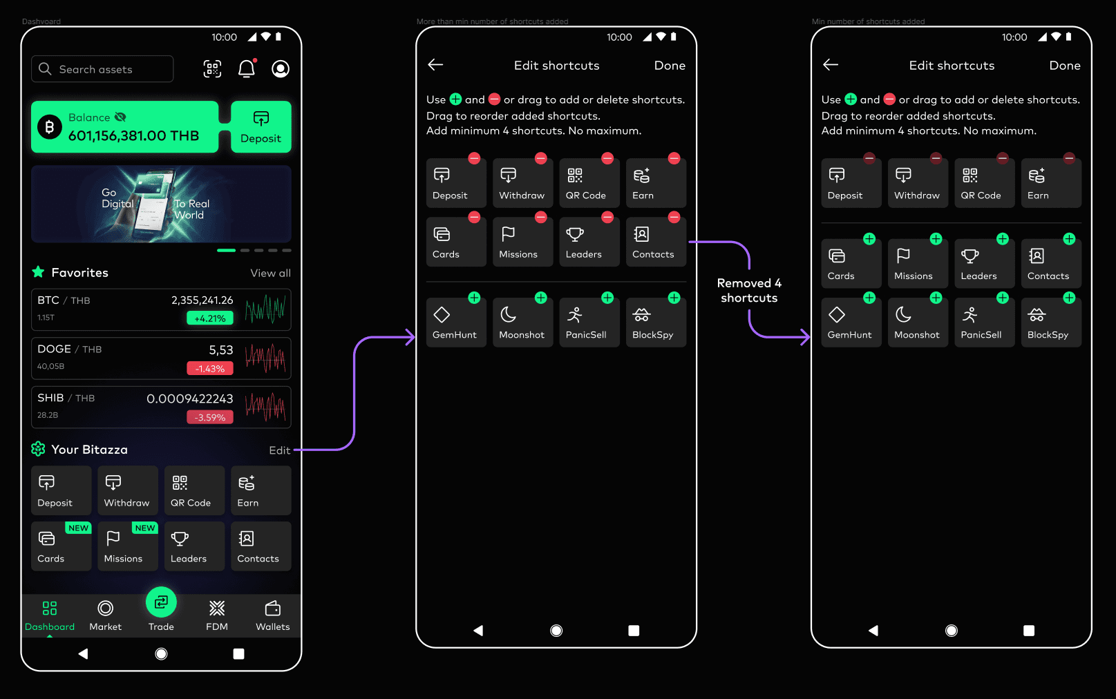
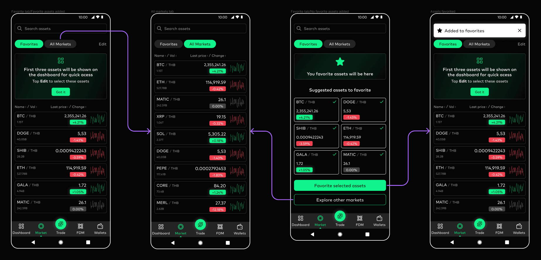
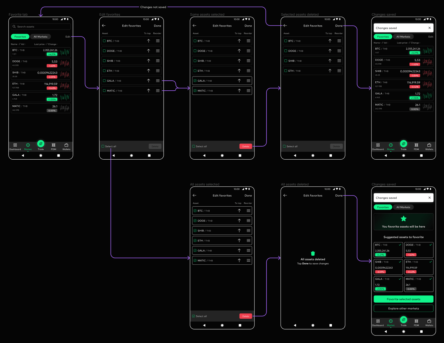
I was tasked with developing four user flows. After reviewing the current ones, I created flows that are simpler and more intuitive.
1. Quick access to frequently used feature from the dashboard — trading a favorite pair.
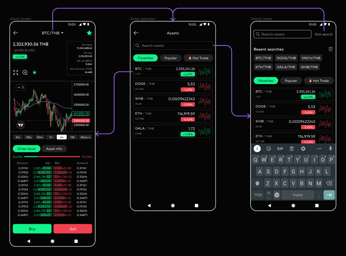
2. Quick view of the current market price of a favorite digital asset.
3. Quick search for a cryptocurrency pair and start trading (e.g., searching for BTC/USDT).
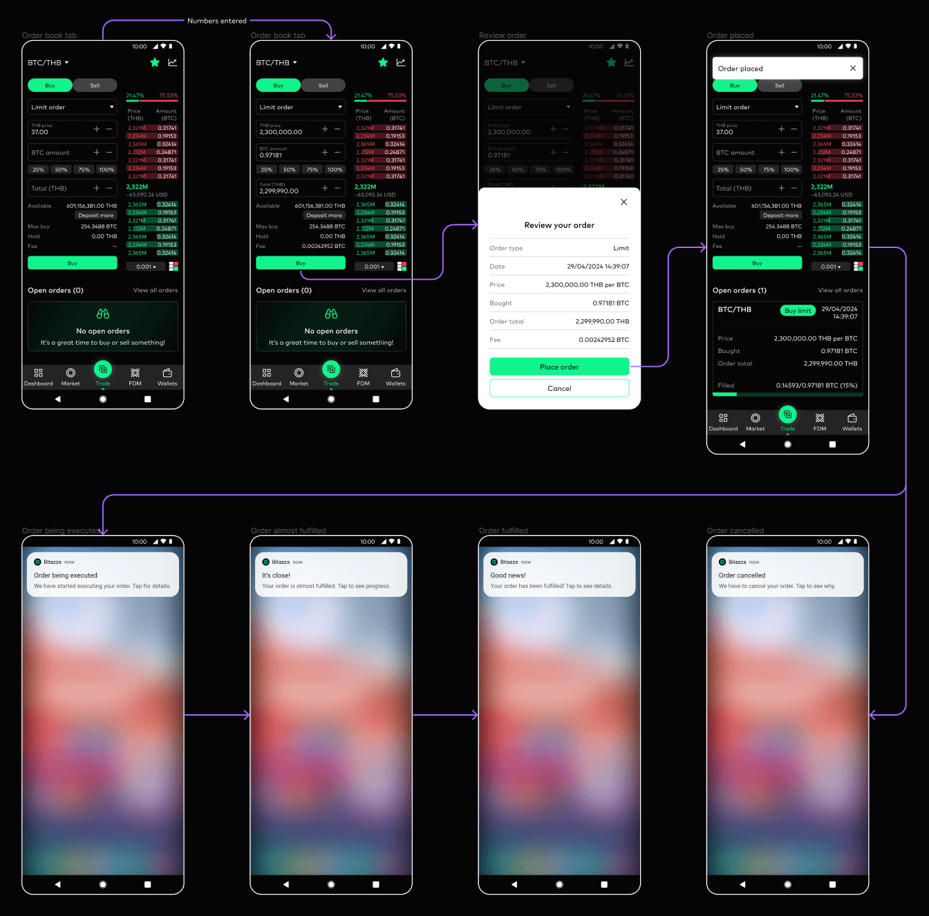
4. Creating a limit order for the THB/USDT pair.
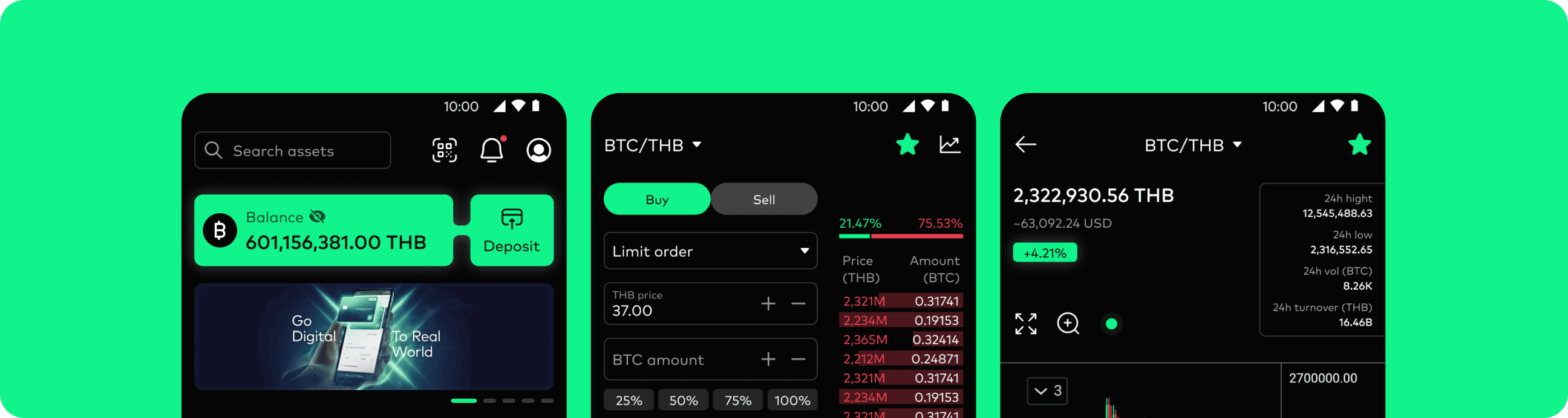
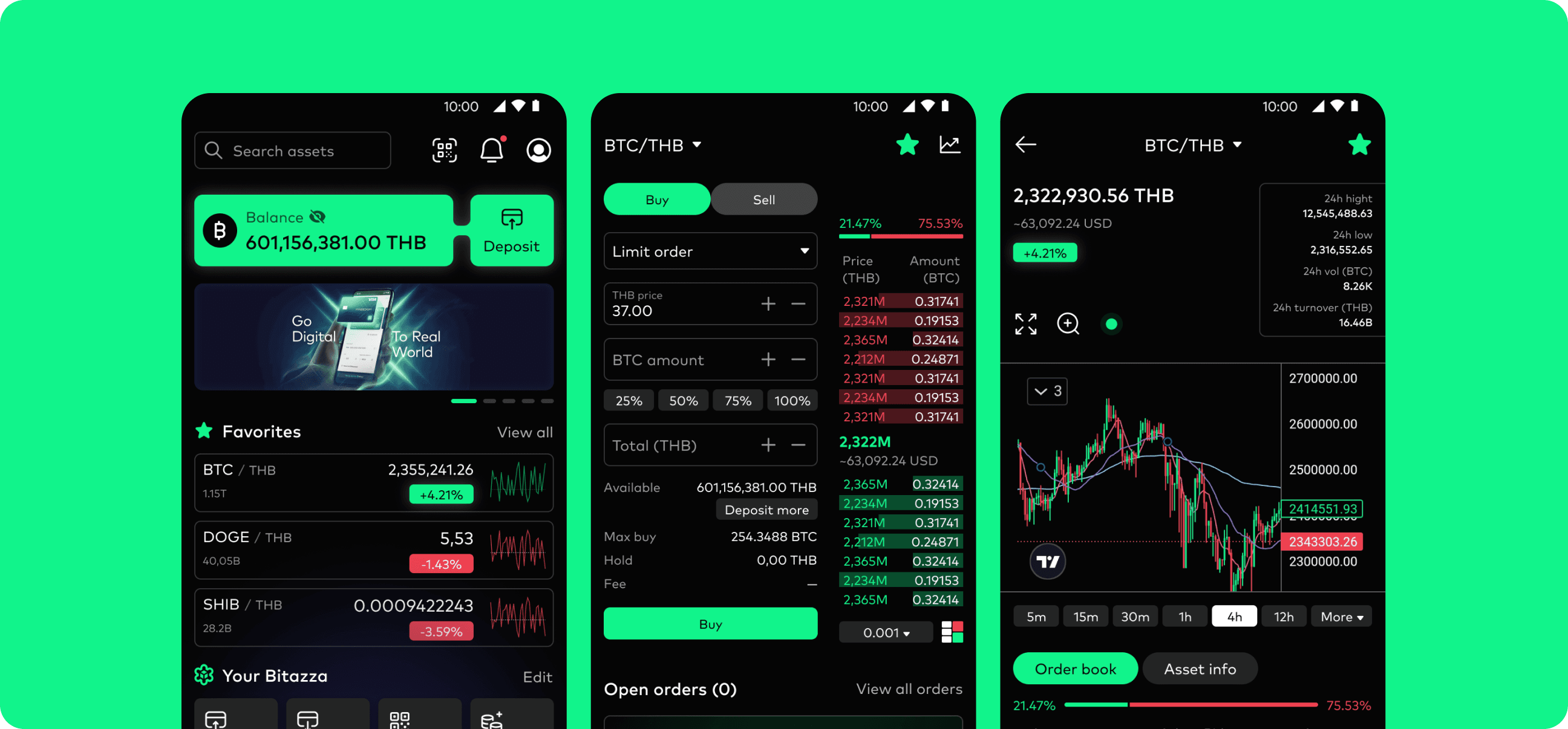
Updated UI
Let’s take a look at the redesigned UI. I used the same colors and fonts since they are tied to the brand and cannot be changed.
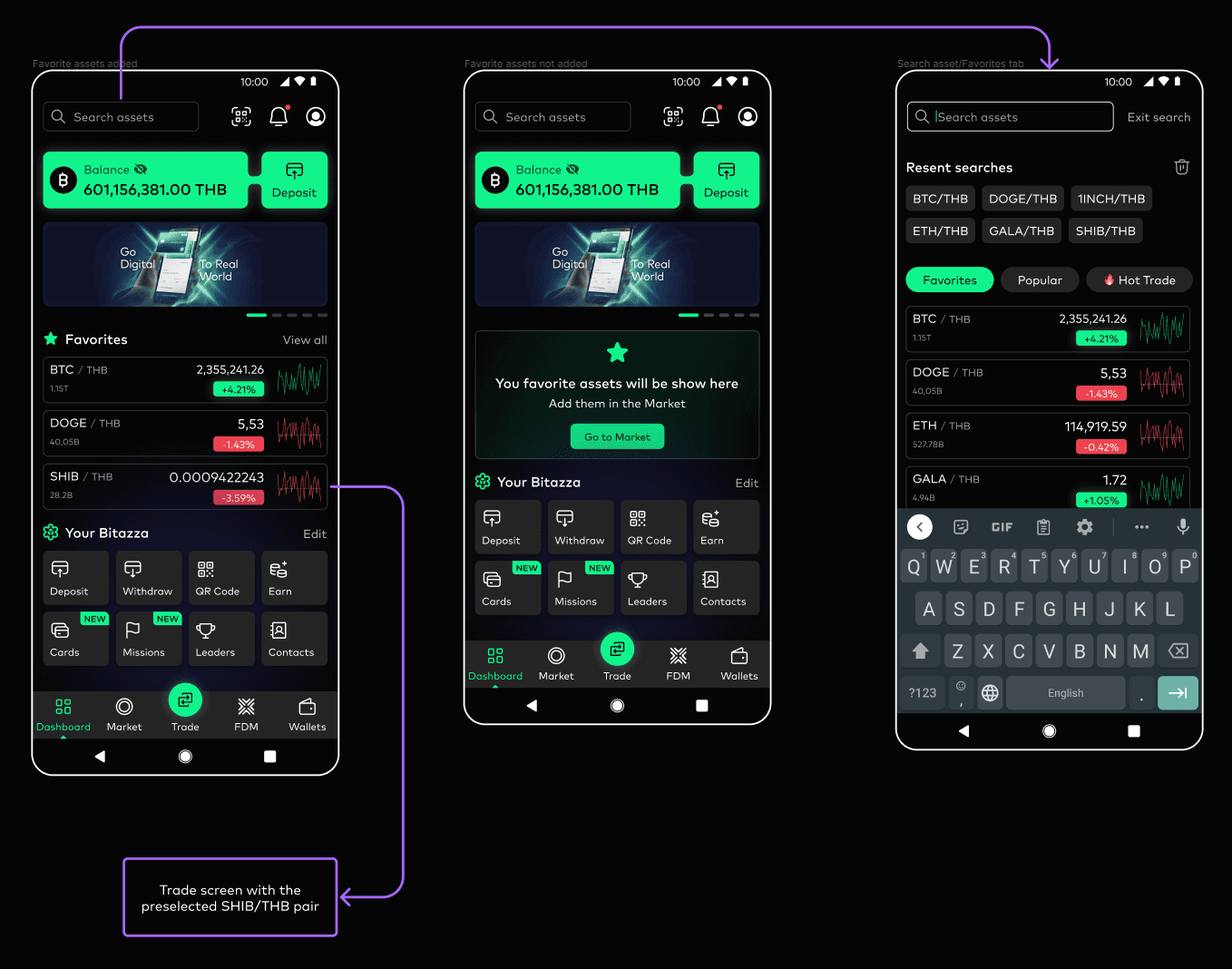
Market
Asset
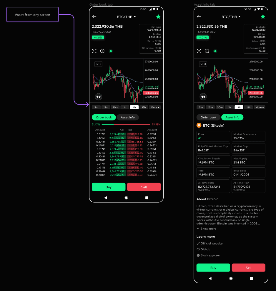
Trade
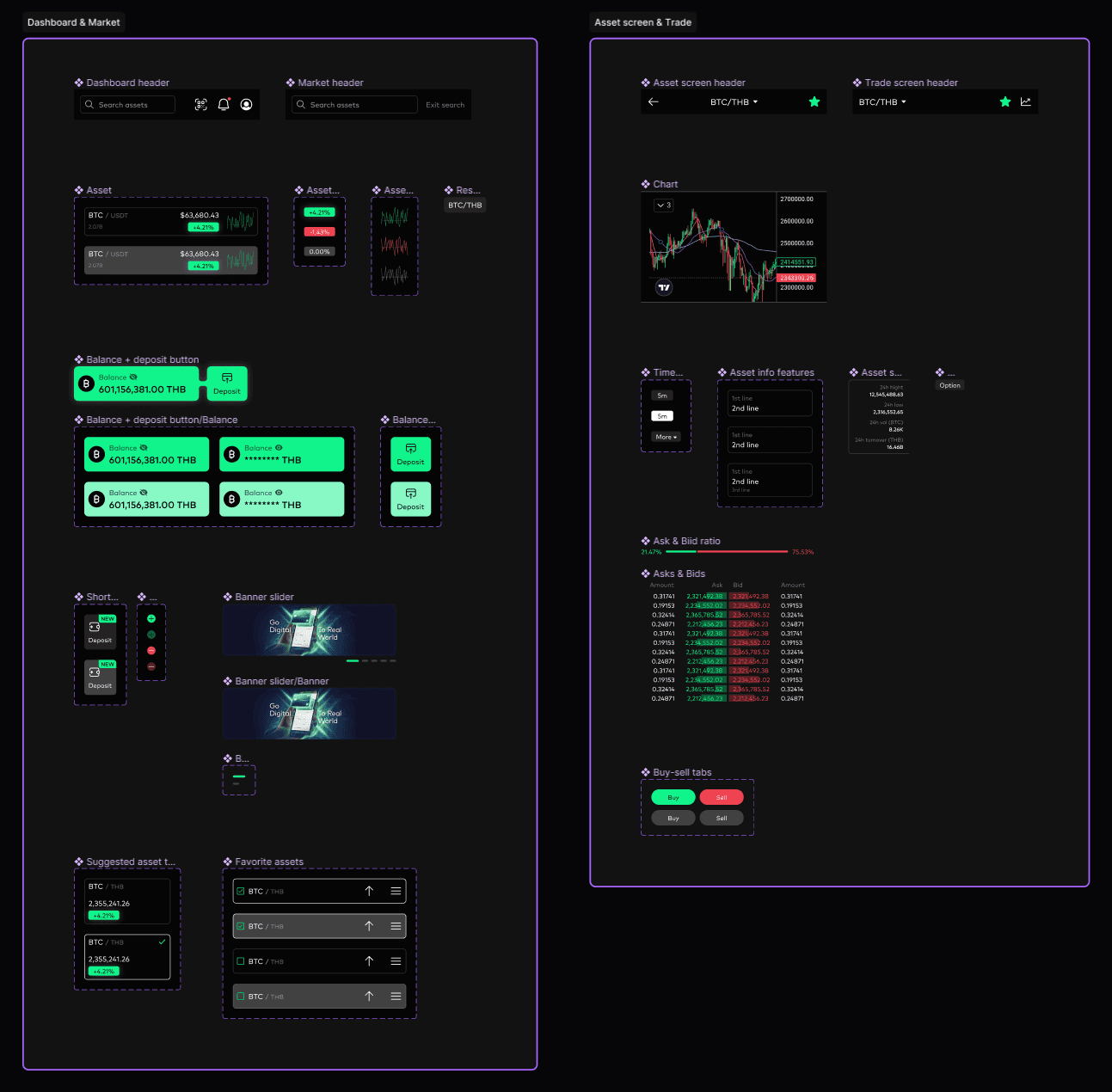
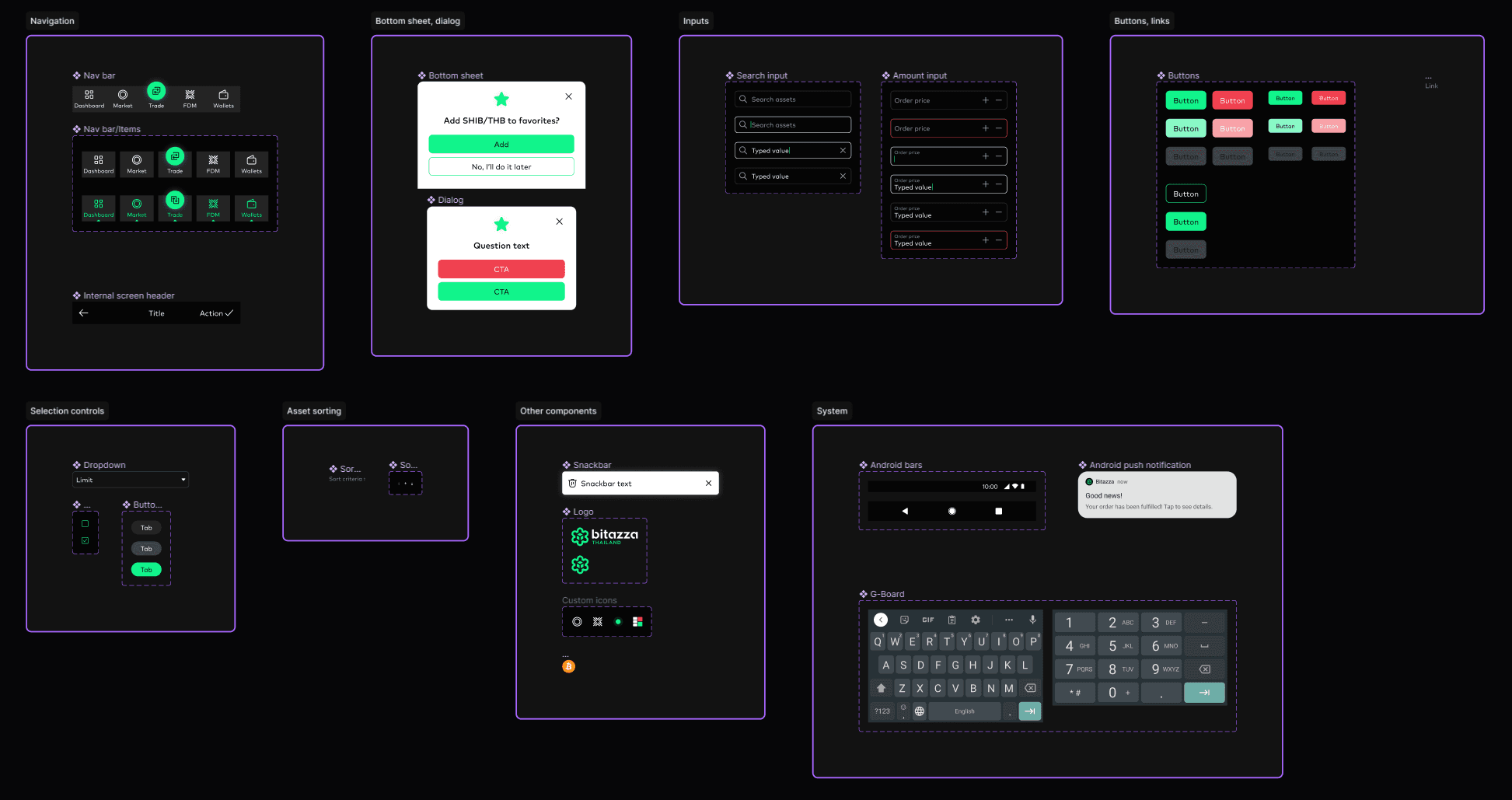
Components
I divided the components into global and local. Global components are used across multiple screens, while local components are specific to individual screens.
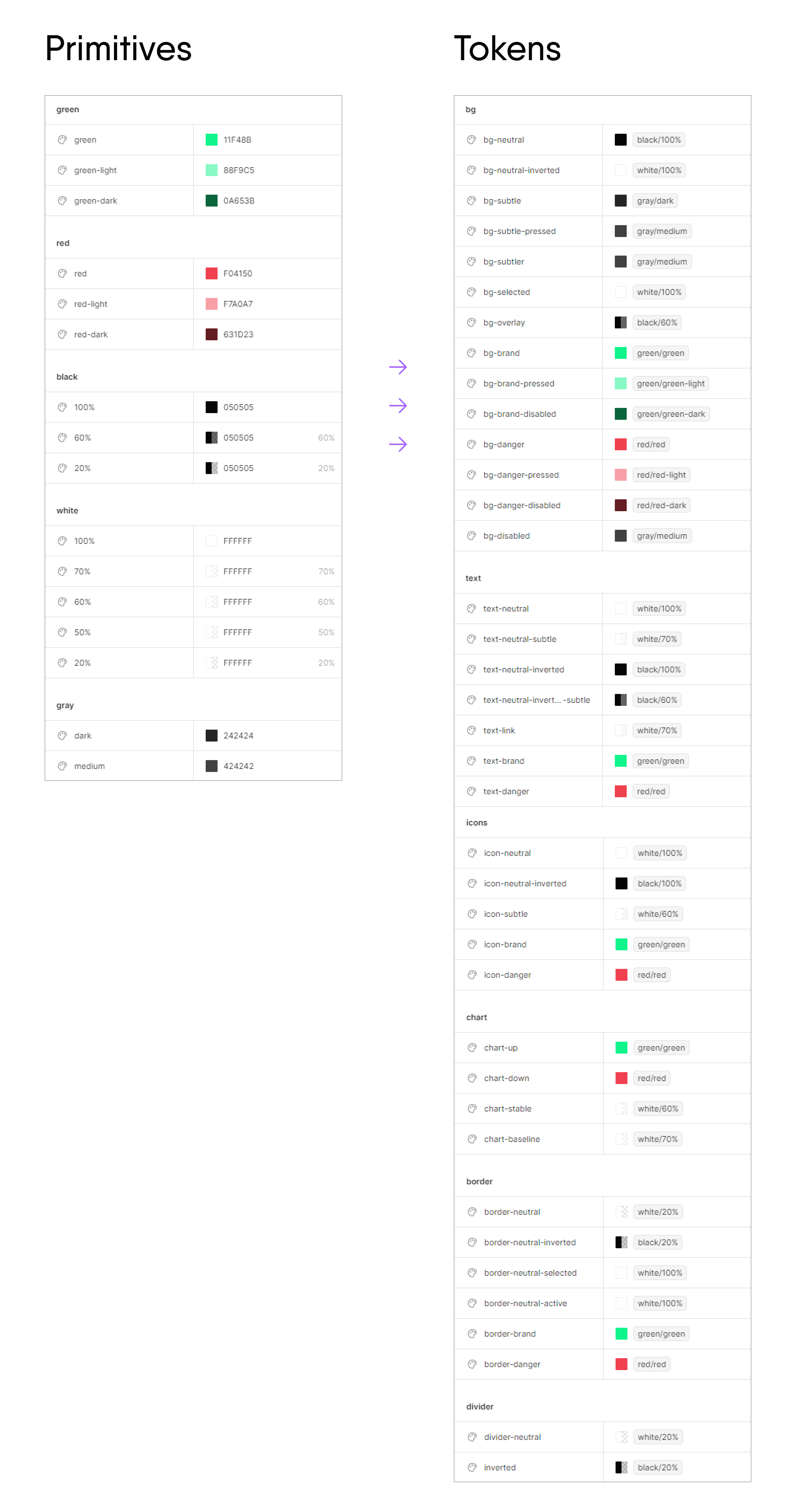
Color tokens
I created color primitives and linked them with design tokens. This is implemented similarly in the design system used by Atlassian, which inspired me.
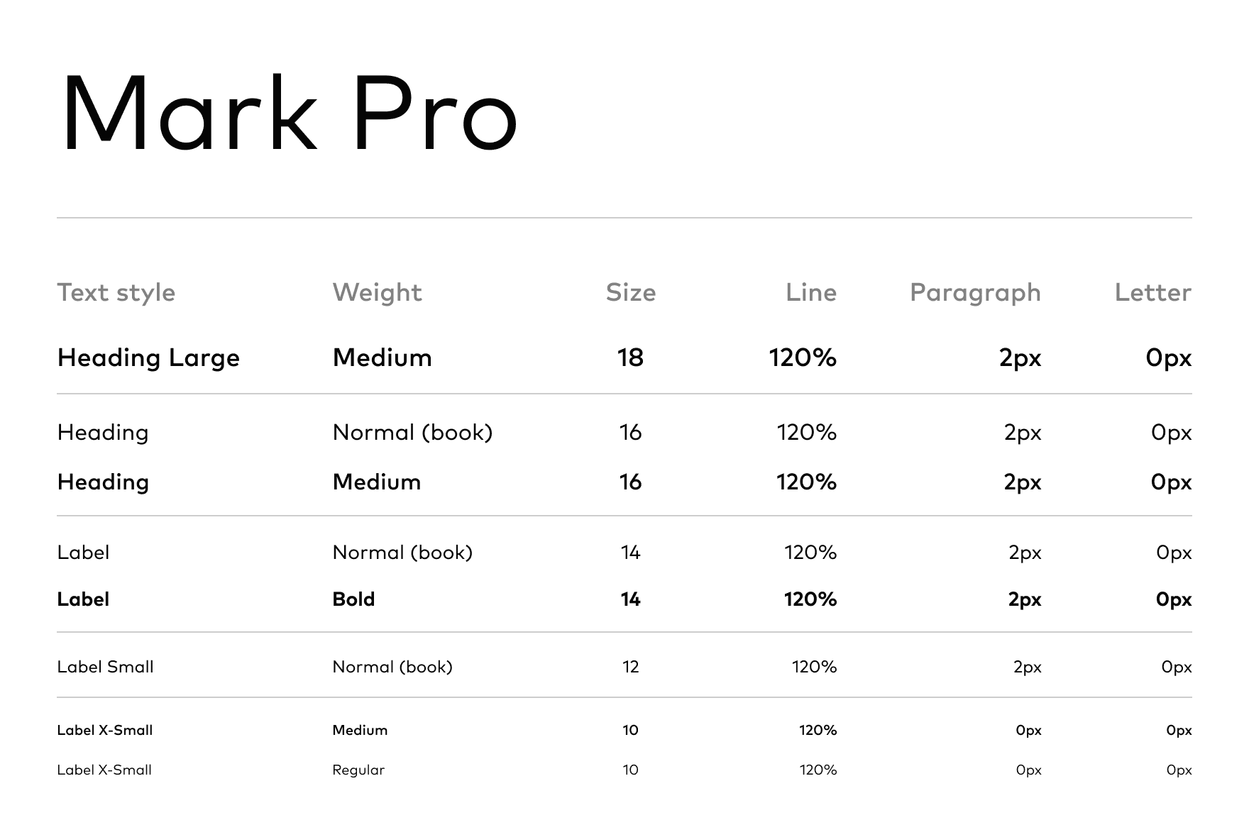
Text styles
I used fairly standard typography for the text.
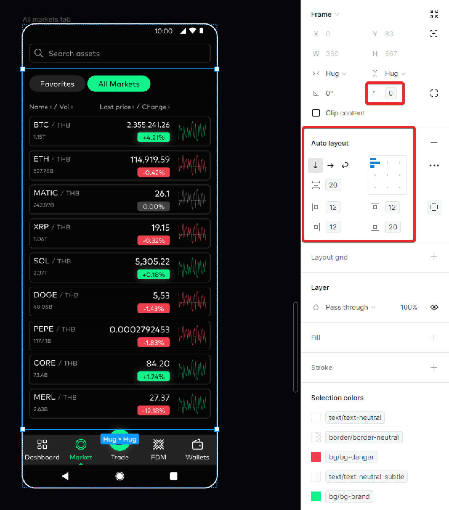
Spacings and corners
For spacing and corner radiuses, I also followed a standard approach: spacing values are multiples of 2 and 4, and corner radiuses are multiples of 4, with an additional value of 500 for fully rounded corners.
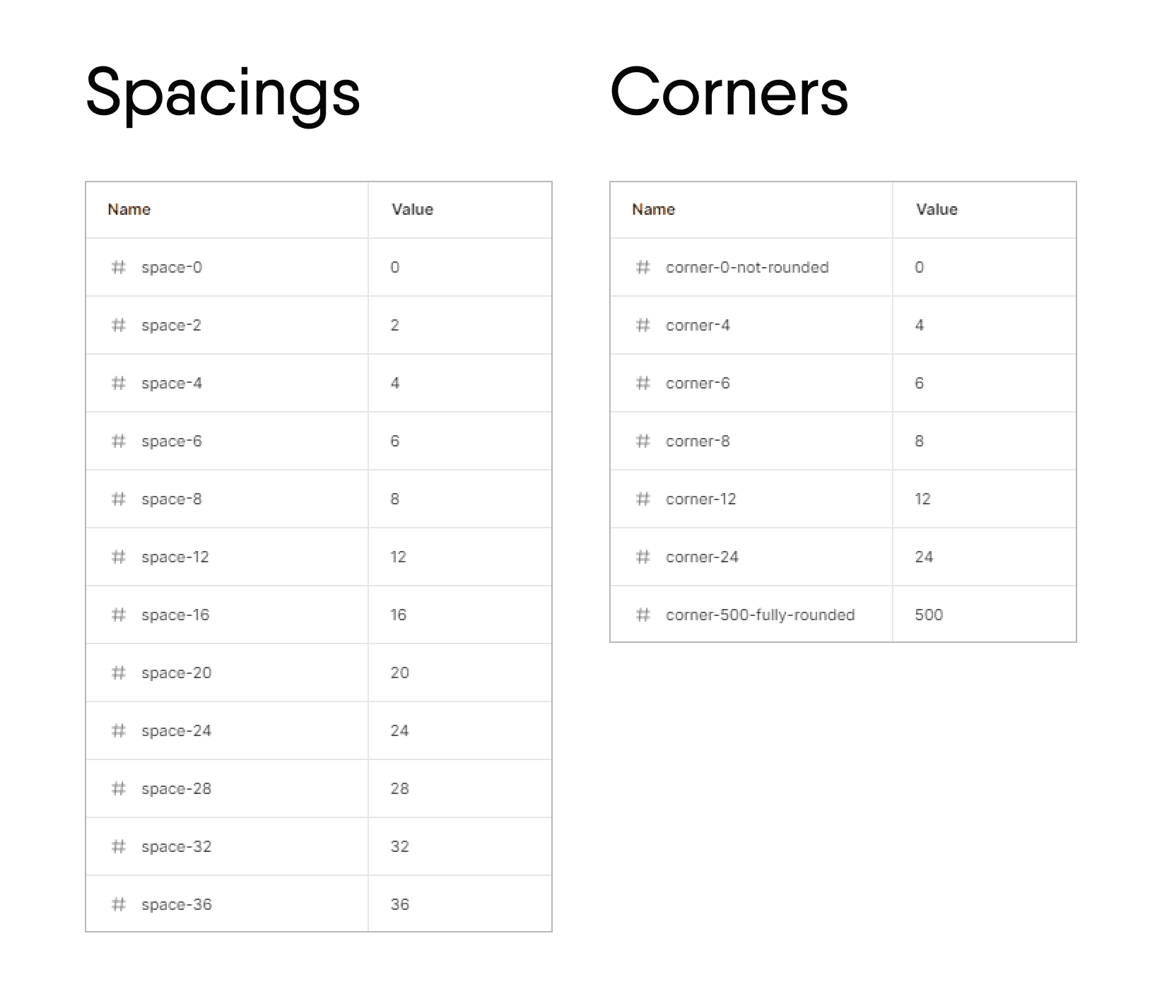
All spacing and corner radius values are linked to the corresponding variables.